Your website’s fonts are speaking to your customers before they read a single word. Typography sets the tone for your entire brand — it can make you look trustworthy and established, or cheap and unprofessional.
At Optimum Design Technology, experts in Business Website Typography in Minneapolis, we know that the right font choice is critical for credibility, readability, and conversions.
Choosing fonts isn’t about what looks “cool.” It’s about strategy.
The Best Fonts for Professional Business Websites
We divide professional typography into 3 core categories:
1. Serif Fonts: For Trust, Tradition & Authority
Serif fonts have small lines or “feet” at the end of letters. They feel classic, trustworthy, and established.
Best for: Law firms, financial services, luxury brands, academic institutions in Minneapolis.
Top Picks: Merriweather, Playfair Display, Georgia, Times New Roman. Use these for headings to convey authority.
Psychology: Trust, respect, tradition.
2. Sans-Serif Fonts: For Modern, Clean & Professional
Sans-serif fonts are clean without the extra strokes. They are the most popular choice for modern business websites because they are extremely readable on all screens.
Best for: Tech companies, startups, corporate services, healthcare, and almost any modern Minneapolis business.
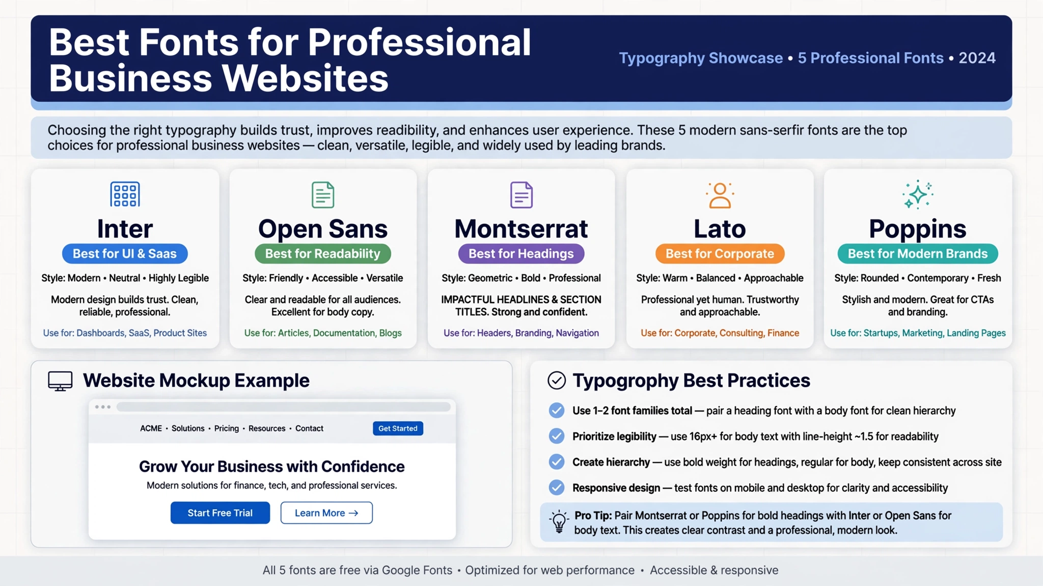
Top Picks: Inter, Open Sans, Montserrat, Lato, Helvetica, Poppins. These are perfect for body text and headings.
Psychology: Modern, clean, straightforward, professional.
3. The Golden Rules for Business Typography
Rule #1: Never Use More Than 2-3 Fonts. Using too many fonts looks chaotic and unprofessional. Stick to one font for headings and one highly readable font for body text. We often pair a strong heading font like Montserrat with a clean body font like Open Sans.
Rule #2: Readability is Everything. If customers can’t read it easily on mobile, they leave. Use 16px minimum for body text, proper line spacing (1.5x), and high contrast (dark gray on white is better than pure black on pure white).
Rule #3: Avoid Decorative & Script Fonts for Business. While script fonts look elegant, they are hard to read and should only be used as a small accent in a logo — never for your website content or navigation.
Rule #4: Speed Matters. Using too many font weights and styles can slow down your website, hurting your SEO. We optimize typography to keep your site fast and Google-friendly.
Is Your Website’s Typography Hurting Your Credibility?
Bad typography — like using Comic Sans, all caps paragraphs, or tiny, hard-to-read text — instantly destroys trust. Good typography makes your brand look expensive, professional, and easy to work with.
At Optimum Design Technology, we specialize in Professional Website Design and Typography in Minneapolis. We don’t just pick fonts; we build a complete typography system that strengthens your brand, improves user experience, and keeps visitors engaged.
Want a website that looks as professional as your business? Contact Optimum Design Tech today at 260-220-9000 or email info@optimumdesigntech.com for a free typography and design audit.