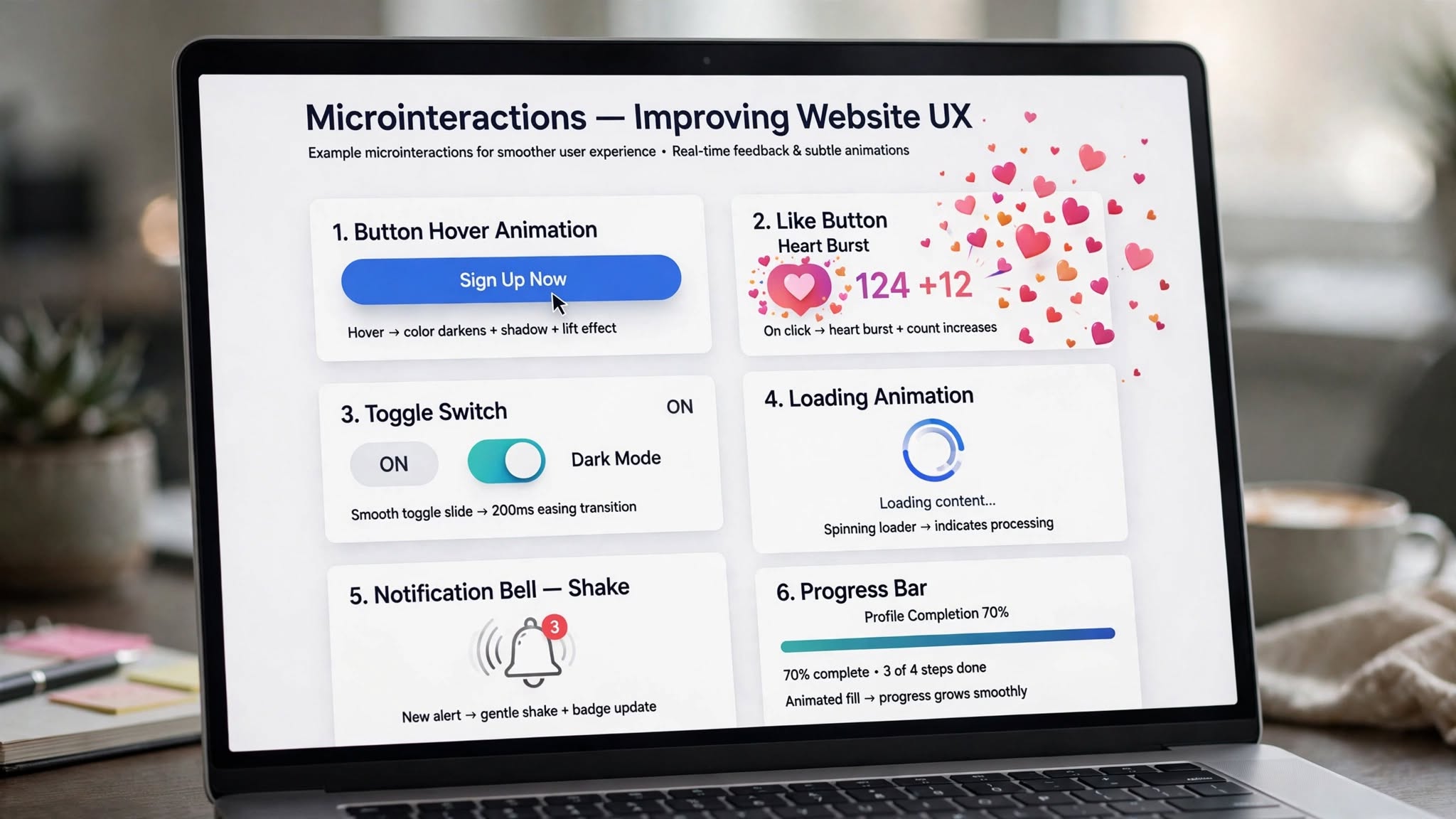
Great website design isn’t just about what users see — it’s about how it feels to use. That’s where microinteractions come in. These subtle, almost invisible animations and feedback moments are what make a website feel intuitive, modern, and enjoyable. At Optimum Design Tech, we use microinteractions in our Minneapolis web design projects to turn good UX into exceptional UX.
A microinteraction is a small, functional animation that responds to a user’s action. Think of the heart that bursts when you like a post, the button that changes color when you click it, or the subtle shake when you enter an incorrect password. Small detail, big impact.
1. Provide Instant Feedback and Clarity
Users need to know their actions were successful. Without feedback, they feel lost and frustrated. Microinteractions solve this. A button that shows a loading animation after being clicked, a toggle that smoothly slides on, or a checkmark that appears after a form is submitted instantly tells the user, “It worked.” This clear communication reduces confusion, prevents duplicate clicks, and makes your website feel responsive and reliable.
2. Make Your Website Intuitive and Easier to Use
Microinteractions are powerful guides. They subtly show users how your website works without needing instructions. For example, a slight bounce on a scroll icon tells users there is more content below, or a product card that lifts on hover signals that it is clickable. These small cues improve usability and help visitors navigate your site effortlessly, leading to a smoother customer journey.
3. Boost Engagement and Emotional Connection
Microinteractions add personality and delight. That little bit of joy when you add something to a cart and it animates into the cart icon makes the experience memorable and fun. These delightful moments create an emotional connection with your brand, making users more likely to stay longer, engage more, and return. For Minneapolis businesses competing for attention, this emotional edge is a huge differentiator.
4. Increase Conversions Without Being Pushy
Well-placed microinteractions can guide users toward conversion. A progress bar on a checkout form motivates users to complete it. A subtle highlight on a call-to-action button draws the eye without being aggressive. A gentle shake on an empty required field prevents form abandonment. They nudge users in the right direction, improving your conversion rate while keeping the experience elegant.
5. Signal Quality and Professionalism
Websites with thoughtful microinteractions feel premium and well-crafted. They show that you care about the details. In contrast, a static site with no feedback can feel outdated and clunky. In the Minneapolis market, where trust is everything, polished microinteractions signal that your business is professional, modern, and detail-oriented.
Microinteractions are small, but their impact on usability and engagement is massive.
At Optimum Design Tech, we specialize in microinteractions web design in Minneapolis that enhances UX and drives real business results. Let us add those thoughtful details that make your website unforgettable.
Want a website that feels as good as it looks?
Call Today for Free Consultation! 260-220-9000