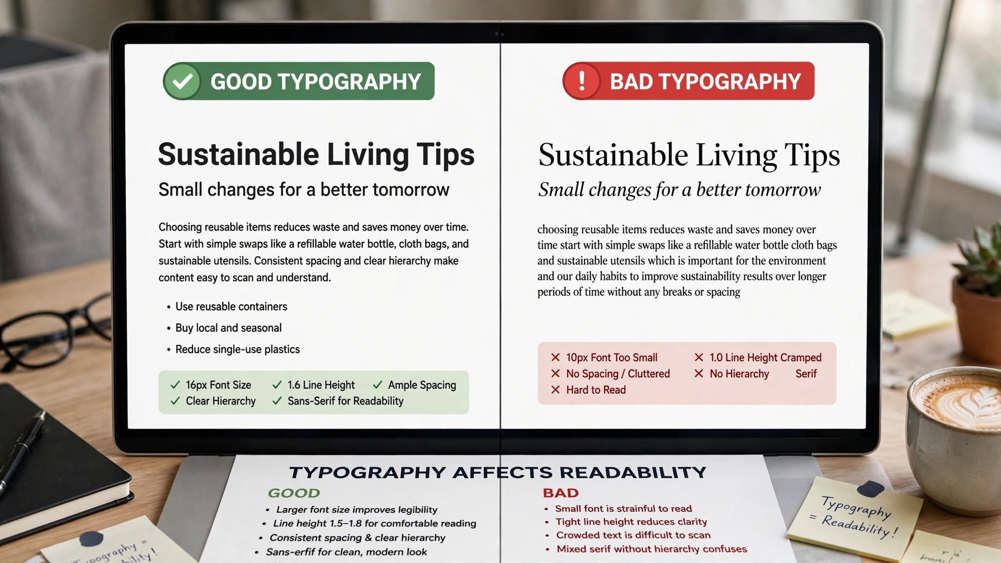
Website can have the best content in the world, but if no one can comfortably read it, it won’t convert. Typography is far more than just picking a pretty font — it’s the foundation of readability, branding, and user experience. At Optimum Design Tech, we see how the right website typography in Minneapolis can keep visitors engaged, while the wrong choices drive them away.
Here’s how your font choices directly impact your website’s success.
1. Readability Determines Whether Your Message Is Read
If your text is hard to read, your message is lost. Key factors that affect readability include font size, line height, line length, and contrast. Body text should be at least 16-18px, with generous line spacing (1.5 to 1.7) and line lengths of 50-75 characters. Poor contrast — like light gray text on a white background — causes eye strain and increases bounce rates. When your site is easy to read, visitors stay longer, absorb more information, and are more likely to take action.
2. Typography Builds Your Brand Identity
Your fonts speak before your words do. A bold, modern sans-serif like Montserrat conveys innovation and confidence, perfect for a tech company. A classic serif like Playfair Display signals elegance and trust, ideal for a luxury brand or law firm. Consistent typography across your website creates a cohesive, professional brand image that customers in Minneapolis will recognize and trust. Inconsistent or trendy fonts, on the other hand, make your brand look amateur.
3. It Guides Users and Improves User Experience
Good typography creates a clear visual hierarchy. By using different sizes, weights, and styles for headlines (H1, H2, H3) and body text, you guide the reader’s eye through the page. Users can quickly scan your content, find what they need, and understand your key points without reading every word. This intuitive flow dramatically improves UX and keeps users from feeling overwhelmed.
4. Impacts SEO and Website Performance
Typography affects more than design — it impacts performance. Using too many font families or heavy font files slows down your website, hurting your Core Web Vitals and Google rankings. We recommend sticking to 2-3 font families (one for headings, one for body) and using modern formats like WOFF2. Fast-loading, readable text is rewarded by both Google and your visitors.
5. Crucial for Mobile Readability
On mobile devices, typography becomes even more critical. Fonts that look great on desktop can become cramped and illegible on a small screen. Responsive typography that adjusts size and spacing for mobile ensures your Minneapolis customers have a flawless reading experience anywhere.
At Optimum Design Tech, we specialize in website typography in Minneapolis that balances beautiful branding with effortless readability.
Is your website’s text working for or against you?
Call Today for Free Consultation! 260-220-9000