Have you ever landed on a website and felt instantly overwhelmed? Too many colors, too many fonts, everything shouting at once — so you leave?
That’s a failure of visual hierarchy.
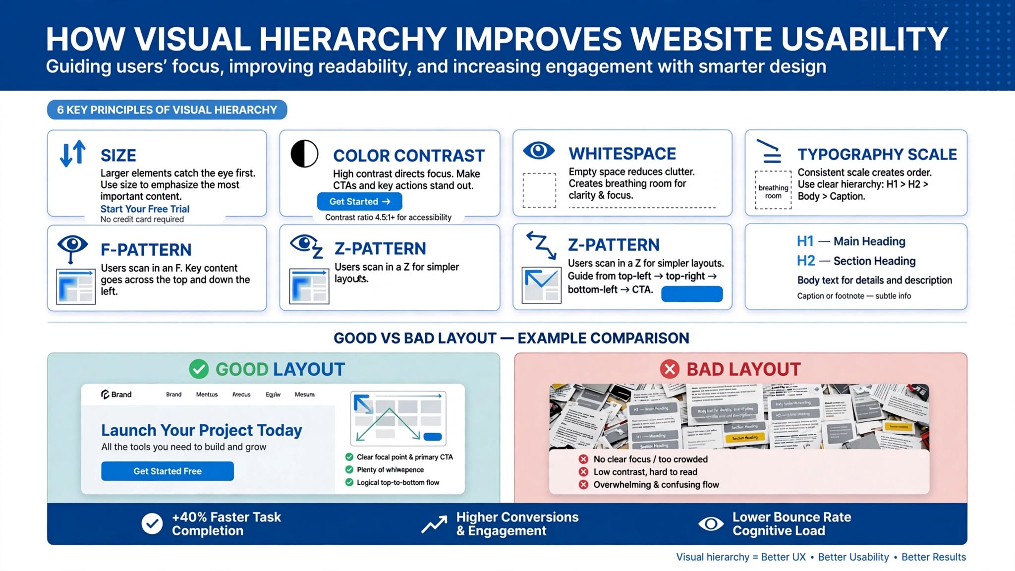
Visual hierarchy is the art of arranging elements on your website so your visitor’s eyes naturally flow to the most important information first. It’s how you control what they see, in what order, and what action they take next.
At Optimum Design Tech, we use Visual Hierarchy Web Design Minneapolis businesses need to turn confusing websites into easy-to-use, high-converting machines.
Good visual hierarchy doesn’t just look better — it makes your website easier to navigate, understand, and buy from.
How Visual Hierarchy Makes Websites Easier to Use
1. It Guides the Eye Like a Salesperson
Think of your website as a conversation. Without hierarchy, it’s everyone talking at once. With hierarchy, you lead the conversation:
Biggest and Boldest = Most Important: Your main headline should be the largest text on the page. It tells visitors what you do in Minneapolis and why they should care.
Second Largest = Supporting Info: Your sub-headline explains how you help.
Brightest Color = Action: Your Call-to-Action button (Get a Free Quote) should be in your brand’s accent color that stands out from everything else.
The eye naturally goes from headline → sub-headline → CTA. That’s a usable website.
2. It Makes Scanning Effortless
No one reads websites. They scan them. Research shows users scan in an F-pattern — left to right, top to bottom.
Visual hierarchy helps scanners by using:
Size: Large headings break up content
Contrast: Dark text on light backgrounds for readability
White Space: Giving elements room to breathe so the brain can process
Grouping: Keeping related items (like phone number and CTA) close together
When scanning is easy, understanding is easy — and conversions go up.
3. It Reduces Decision Fatigue
When everything on a page has the same size, color, and weight, the brain has to work harder to figure out what’s important. That mental effort causes frustration and bounces.
By making primary actions (Call Now) visually dominant over secondary actions (Learn More), you reduce choices and guide visitors to convert.
The 3-Second Test for Your Minneapolis Business Website
Squint at your homepage for 3 seconds. What do you see first?
Is it your headline and CTA button? You have good hierarchy.
Is it your navigation menu, 5 different images, and 3 competing buttons? You have bad hierarchy — and you’re losing customers.
In a competitive market like Minneapolis, usability wins. A website that is easy to navigate and understand feels more trustworthy and professional.
At Optimum Design Tech, we don’t just design pretty sites. We design sites with intentional visual hierarchy that leads visitors straight to your phone number and quote form.
Is your website guiding visitors to take action, or confusing them into leaving?
Call Today for Free Consultation! 260-220-9000