How Website Design Influences User Behavior: Design the Click, Not Just the Look
Your website doesn’t just sit there — it actively shapes what visitors do. Every font choice, image, button color, and section of whitespace nudges users toward action or toward the back button. For Minneapolis businesses, understanding how design drives behavior is how you turn traffic into revenue.
Design Affects How Users Interact With Your Website
People don’t read websites like books. They scan in seconds, look for patterns, and make snap judgments. Eye-tracking studies show users follow predictable paths: F-patterns for text-heavy pages, Z-patterns for simple layouts. Strategic design uses those patterns to place key info where eyes naturally go. Bad design creates friction. Good design makes the next click feel inevitable.
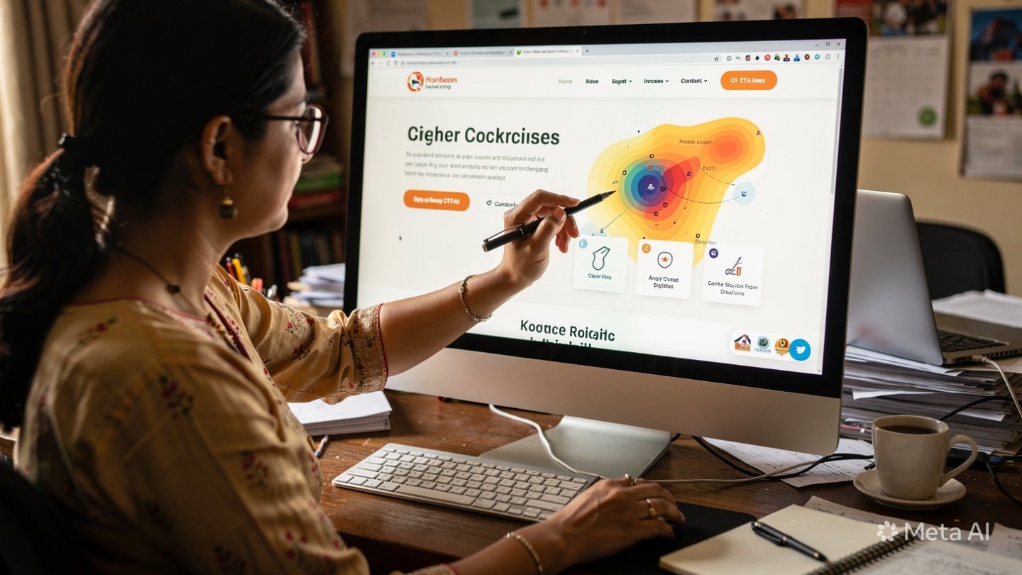
Visual Hierarchy, Color Psychology, and CTA Placement Influence Actions and Engagement
Behavioral design uses psychology to guide decisions:
1. Visual Hierarchy Tells Users What Matters Most
Size, weight, spacing, and position create importance. Your H1 should be the largest text on the page because it answers “Am I in the right place?” Key benefits get bold subheads. Supporting details stay smaller. Users follow visual cues: big → small, top → bottom, left → right. If everything screams for attention, nothing gets it.
2. Color Psychology Triggers Emotion and Action
Color isn’t decoration — it’s communication. Blue builds trust, which is why banks and healthcare use it. Red creates urgency for sales. Green signals “go” and works for eco brands. High contrast draws the eye. That’s why CTAs need to stand out from the background. A gray button on a white page gets ignored. An orange button pops. For Minneapolis sites, test CTA colors against your brand palette to see what drives clicks.
3. CTA Placement Removes Decision Fatigue
Users shouldn’t hunt for your “Contact Us” button. Place your primary CTA above the fold, repeat it after key sections, and keep it in the sticky header. Use action-oriented copy: “Get My Free Quote” beats “Submit.” Reduce form fields to the minimum. Each extra field drops conversion rates 11%. Smart placement plus low friction = more leads.
4. Whitespace and Grouping Reduce Cognitive Load
Cluttered pages overwhelm users. Whitespace — empty space between elements — helps the brain process info. Group related items: service + icon + short description + button. That chunking makes decisions easier. A clean layout says “we’re professional” and keeps users focused.
5. Social Proof and Directional Cues Build Momentum
Faces looking toward your CTA, arrows, and lines subtly direct attention. Testimonials and logos near CTAs reduce risk right before the click. A Minneapolis contractor showing “500+ homes served” next to the quote button increases confidence at the decision point.
At Optimum Design Technologies, We Use Strategic Design to Guide User Behavior Effectively
We don’t design just to make things pretty. We map user journeys, test heatmaps, and build layouts that move visitors from curiosity to contact. Because in Minneapolis or anywhere, the best website isn’t the flashiest — it’s the one that gets people to act.
Design isn’t art when it’s on your site. It’s persuasion. Use it wisely.