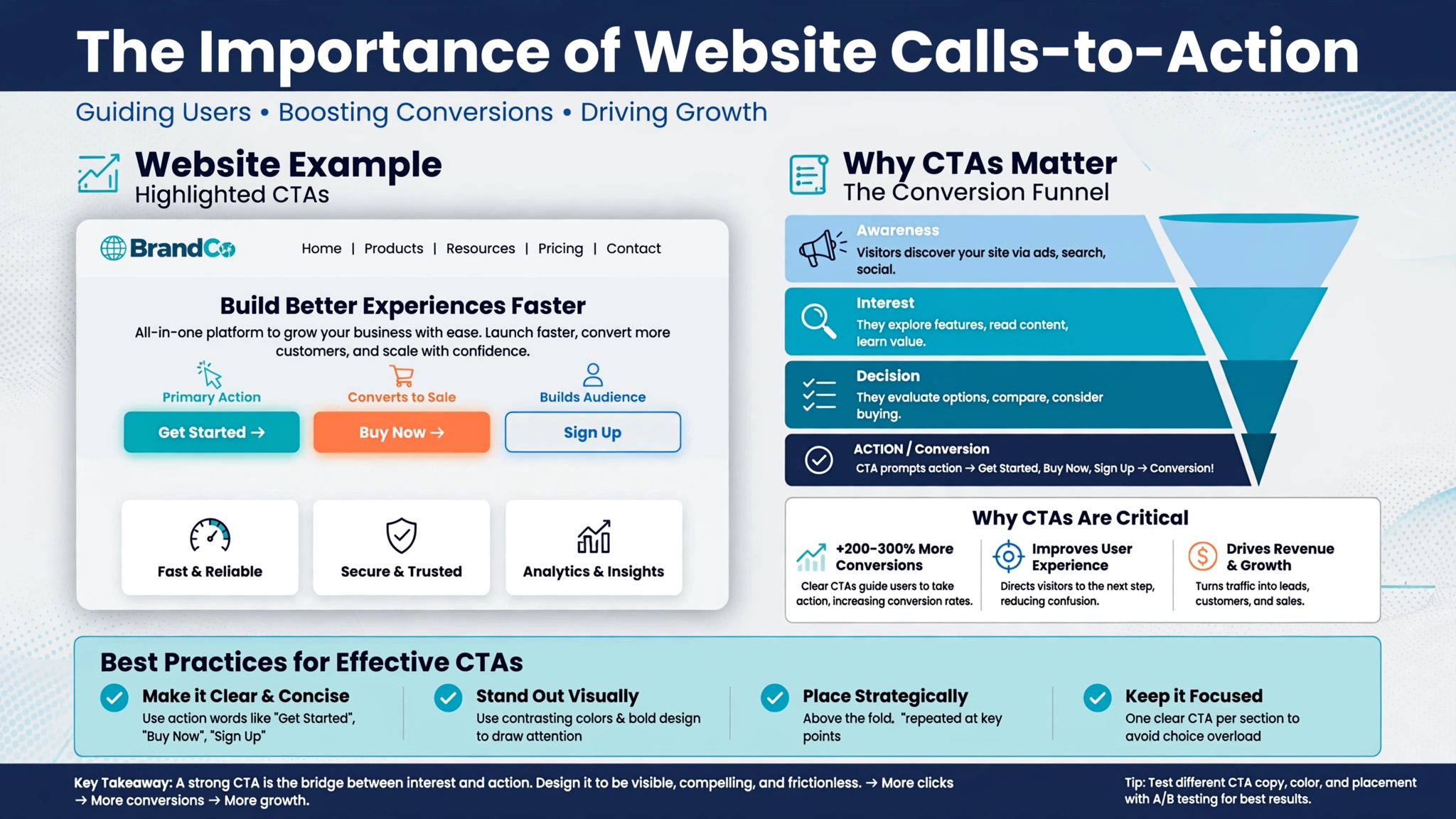
Your website looks great and gets traffic, but the phone isn’t ringing. Why? The problem is often missing or weak Calls-to-Action (CTAs).
A CTA is the bridge between a visitor and a customer. Without it, even the most interested visitor won’t know what to do next.
At Optimum Design Technology, experts in Website CTA Design in Minneapolis, we design CTAs that don’t just look good — they convert.
What is a Call-to-Action?
A Call-to-Action is a prompt that tells your user exactly what action to take. It can be a button, a link, or a form. Examples include: “Get a Free Quote,” “Schedule a Consultation,” “Shop Now,” or “Call Us Today.”
Why Are Effective CTAs Critical for Your Minneapolis Business?
1. They Guide User Behavior and Increase Conversions
Users need direction. A strategically placed, compelling CTA removes guesswork and guides visitors through your sales funnel. Instead of passively browsing, they are actively led toward contacting you, booking a service, or making a purchase. This is how you turn website traffic into real leads and sales.
2. They Improve User Experience (UX)
Good CTAs actually make your website easier to use. They answer the user’s unspoken question: “What should I do next?” When placed logically at the end of service descriptions, blog posts, and homepage sections, CTAs create a natural, helpful journey.
3. They Boost Your ROI
You invest in SEO and marketing to get people to your site. A powerful CTA ensures that investment pays off. A simple change in CTA color, text, or placement can increase conversions by over 200%. For Minneapolis businesses, that means more revenue from the same website traffic.
How to Create a High-Converting CTA?
Use Action-Oriented Language: Don’t use boring text like “Submit” or “Click Here.” Use strong verbs: “Get My Free Estimate,” “Start Growing Today,” “Claim Your Discount.”
Create Urgency and Value: Give them a reason to act now. “Limited Time Offer,” “Free Consultation This Week,” or “Download Your Free Guide.”
Make It Visually Stand Out: Your CTA button should pop. Use contrasting colors, ample white space, and large enough fonts so it can’t be missed on desktop or mobile.
Place It Strategically: Don’t just put a CTA at the bottom of the page. Place primary CTAs above the fold, after key benefits, and at the end of every service section.
Are Your CTAs Working Hard Enough?
If your website has weak, hidden, or generic CTAs, you are leaving money on the table.
At Optimum Design Technology, we specialize in conversion-focused Website CTA Design and Optimization in Minneapolis. We analyze your user journey and place data-driven CTAs that get clicked.
Ready to turn more visitors into customers? Contact Optimum Design Tech today at 260-220-9000 or email info@optimumdesigntech.com for a free conversion audit.