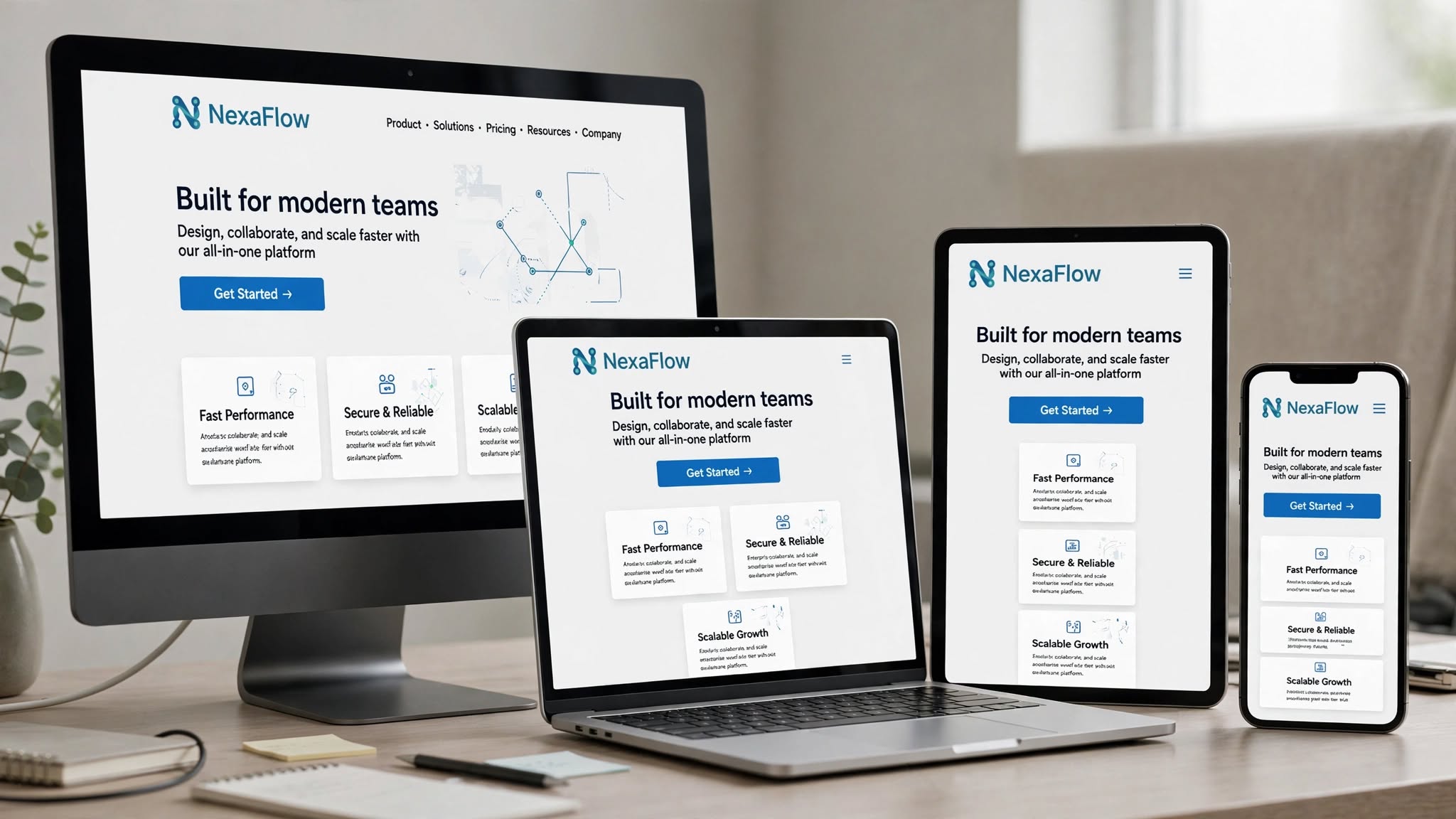
Customers are finding you everywhere — on a desktop at work, on a tablet on the couch, and on a smartphone on the go. If your website looks and feels different on each device, you’re not just creating confusion — you’re losing trust and sales. At Optimum Design Tech, we help Minneapolis businesses create consistent website design that delivers a seamless experience, no matter the screen size.
Consistent, responsive design is no longer a luxury. It’s essential for branding, user experience, and SEO.
1. Strengthens Brand Recognition and Trust
Your website is your brand’s digital storefront. Consistent use of colors, fonts, logos, imagery, and tone of voice across all devices reinforces your brand identity. When a customer visits your site on their phone and then later on their laptop, they should instantly recognize it as the same trusted company. Inconsistency makes your brand look unprofessional and fragmented. Consistency builds credibility — a critical factor for Minneapolis businesses looking to stand out.
2. Creates a Seamless User Experience (UX)
Imagine learning to navigate a website on desktop, only to have to relearn it completely on mobile. That friction causes frustration and abandonment. Consistent website design ensures that navigation, buttons, layouts, and calls-to-action are familiar and predictable on every device. Users can easily pick up where they left off, which dramatically improves usability, reduces bounce rates, and keeps them moving toward conversion.
3. Boosts Your Google Rankings
Google uses mobile-first indexing, meaning it primarily looks at your mobile site to determine your rankings. If your mobile experience is inconsistent, slow, or broken, your SEO will suffer. A fully responsive, consistent design ensures that Google sees a high-quality, unified website. This improves your Core Web Vitals, lowers bounce rates, and helps you rank higher for searches like “consistent website design Minneapolis” and other local keywords.
4. Increases Conversions Across All Platforms
A consistent journey leads to consistent results. When your call-to-action is easy to find and your checkout or contact form works perfectly on every device, you capture leads you would otherwise lose. A customer might start researching on their phone and convert on their desktop later. If the experience is consistent, that conversion happens seamlessly.
5. Saves Time and Future-Proofs Your Business
A responsive, consistent design is easier to manage and update than maintaining separate desktop and mobile versions. It also future-proofs your business as new devices — from foldable phones to larger tablets — continue to emerge.
Your brand should feel the same, everywhere.
At Optimum Design Tech, we specialize in consistent, responsive website design in Minneapolis that looks perfect and performs flawlessly on every screen. We make sure your brand never misses a beat.
Ready for a website that delivers a flawless experience on every device?
Call Today for Free Consultation! 260-220-9000